> ## Documentation Index
> Fetch the complete documentation index at: https://www.propeldata.com/llms.txt
> Use this file to discover all available pages before exploring further.
# Shadows
> Select shadow styles for your components.
Shadows used in the components are derived from a 6-step scale.
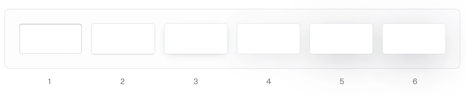 #### Shadow tokens
Shadow tokens can be accessed using CSS variables. You can use these tokens to style your custom components, ensuring they are consistent with the rest of your theme.
```css theme={"system"}
/* Inset shadow */
var(--shadow-1);
/* Shadows for variant="classic" panels, like Card */
var(--shadow-2);
var(--shadow-3);
/* Shadows for smaller overlay panels, like Hover Card and Popover */
var(--shadow-4);
var(--shadow-5);
/* Shadows for larger overlay panels, like Dialog */
var(--shadow-6);
```
#### Shadow tokens
Shadow tokens can be accessed using CSS variables. You can use these tokens to style your custom components, ensuring they are consistent with the rest of your theme.
```css theme={"system"}
/* Inset shadow */
var(--shadow-1);
/* Shadows for variant="classic" panels, like Card */
var(--shadow-2);
var(--shadow-3);
/* Shadows for smaller overlay panels, like Hover Card and Popover */
var(--shadow-4);
var(--shadow-5);
/* Shadows for larger overlay panels, like Dialog */
var(--shadow-6);
```